Overview
This dashboard provides a global analysis of Covid-19 impacts by summarizing total cases and deaths, geographic spread, and the percentage of population affected over time. It allows decision-makers, researchers, and public health officials to quickly assess where the virus has had the most significant effect and identify patterns by region.
Objective
- Visualize the global spread and severity of Covid-19
- Compare death tolls by continent
- Show how the percentage of population affected varies by country and time
- Deliver accessible insights to inform global health strategies
Methodology
This dashboard was developed using Tableau, drawing from global Covid-19 datasets (e.g., WHO, Johns Hopkins). Key indicators such as total cases, deaths, and population impact were aggregated and analyzed by continent and country.
Visual elements include high-level KPI summaries, bar charts for continent-level comparison, a geographic map for country-level impact, and a time series chart showing how infection rates changed over time. The dashboard was designed for interactive exploration, making it accessible to public health analysts, policy-makers, and the general public.
Visualizations Explained
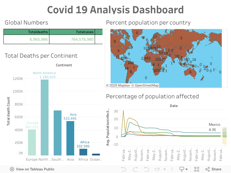
- KPI Cards: Present high-level statistics for total deaths and cases—allowing immediate benchmarking.
- Bar Chart (Deaths by Continent): Effective for comparing total fatalities and identifying regional hotspots.
- Map (Percent Population Affected): Offers a geographic distribution view of Covid-19 impact. Bubble sizes and labels indicate severity.
- Line Chart (Percentage of Population Affected Over Time): Tracks infection trends globally, highlighting both surges and improvements.
Key Insights
As of the time of analysis, Covid-19 had resulted in over 764 million confirmed cases and nearly 7 million deaths globally. North America emerged as the hardest-hit continent, recording more than 1.18 million deaths, followed by Asia and Europe with 533,495 and 402,232 deaths, respectively.
The percentage of population affected was highest in countries like Mexico, with a rate of 4.35%. Most nations experienced significant early spikes in infection rates, which gradually declined over time. The geographic spread, visualized through a heat map, shows major concentrations of cases across North America, Europe, and parts of South America.
Recommendations
- Focus on strengthening public health infrastructure in high-fatality regions like North America.
- Conduct further analysis into demographic, economic, and healthcare factors influencing outcomes.
- Use real-time data and projections for more dynamic planning.
- Extend this dashboard with vaccination rates, hospital capacity, or variant-specific data.
Conclusion
This dashboard efficiently communicates the global story of Covid-19 using clear and interactive visualizations. It can serve as a foundation for further exploration into epidemiological trends, healthcare disparities, and global response effectiveness.